Thursday, 20 December 2012

Preliminary Task: Final Cover, Contents and Evaluation


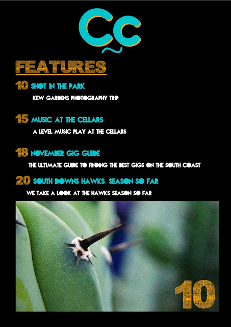
Both of the images above are the final versions of my front cover and contents page if you hadn't already guessed! After all of the planning and drafting I finished my magazine cover and contents page for the preliminary task. On the whole I'm quite pleased with it, there are several things that if I did it again I would change, for example I spent a lot of time trying to work out what to use to link the image with the text in the contents page, and I also forgot to include the page number in the top image, the best I could come up with was arrows for the link, but I don't think that this worked that well. 

As far as the front cover goes I think I met my standards and was unusually creative with the cover-lines and choice of font. I don't think there would be much I would change with the front cover, maybe the shape of which the cover-lines formed. Overall I think that this preliminary task was a success and has let me have a snapshot as to what to do for my Music Magazine, the final task, and then what to avoid.

Preliminary Task: Draft of Magazine


The two images above show the front cover and the contents page for my College Magazine for my preliminary task. I feel that the front cover is almost complete, with several things that need changing, like the font for the date and issue number, I think they should probably be the same front as the the rest of the coverlines, Nova, rather than the same font as the masthead, Brain Flower, also I think the colour should be orange to contrast the masthead, this will mean they stand out.

Another thing, again which is a small thing I think I should tweak with the front cover of the magazine is the masthead, I think the shadow should be orange to make it stand out more, the orange will contrast the turquoise and make the magazine stand out over other things that are available round college.

With my contents page I'm planning to redo the whole page, I feel that there isn't enough text and not enough images on the page, this is due to the layout, so for my flatplan I will show how I want the contents page to look. I'm thinking of putting an image relating to something on the contents page at the top, then having the contents title to be the same font and same colour scheme as the masthead on the front cover. Then I will seperate features and regulars into different sections, with an image taking up a 1/3, and then 2/3 writing, this will take up about a quarter of the page each. The colour scheme of the writing will be the same as it is here.

Overall I think that both will turn out to be fairly successful with changes that I plan to make, and I also think after these changes the magazine will look professional and meet my standards that I expect from myself.

Tuesday, 18 December 2012

Proposal Of My College Magazine

I have a few initial ideas for my college magazine, overall the general idea for my magazine will be to make an individual, unique magazine that will stand out and appeal to the my target audience, teenagers who attend south downs college.


  • COLOUR SCHEME: As far as colours go I think that I will use turquoise, orange and white, fairly similar to 'College Magazine' featured in the last article. I hope that the orange, being in november will symbolise autumn, which is the season we are in!
  • FONTS: For the Masthead and Contents Title I am thinking of using 'BrainFlower' a font that is occasionally used in day to day life, but isn't overused, I think that it will give a fairly modern feel to the magazine, and be the kind of font that teenagers are familiar with, for the coverlines, date etc. I will use 'Nova Bold' which I have never seen used before, which makes me more inclined to use it, as I think both fonts together may not seem like they go at first but I think that they may compliment them if I use them in the right context with the correct font size. Another font I want to use, but more in the contents page than anything else will be 'Asmat 2007', I will use it for the title of the sections - regulars and features and the page numbers, I think that this will compliment the Nova font I will use in the main bulk of writing, giving the contents page a more professional effect.
  • COVER IMAGE: I will use a portrait I have taken of one of my friends Jack, a photography AS student, as he is a model student of this college (haha). Also it related back to the main coverline I have in mind as it will be about the AS photography trip to Kew Gardens.
  • IMAGES IN THE CONTENTS PAGE: As the magazine will feature a lot about photography of nature and it is spring I propose to use several images from the kew gardens trip and one that will look forward to next month - December, this will mean something Christmasy and something that will make the page featured stand out and make people want to turn to that page and read it, which is essentially what I want to happen with everything I do, but more so with contents with images. 
  • CONTENTS LAYOUT: I think initially it will involve more about playing around with various layouts rather than sticking to one idea, one of my ideas is to have a title and a small underline, then have a list of features and regulars below, with an image at the bottom.
Hopefully all of these factors will meet the targets of the task as well as meeting my expectations of what I am capable of. I will work to what I think is a fairly high standard for myself as I want this piece to be successful, but also something that I enjoy working, so it will incorporate a lot of my work, and also incorporate a lot of things that interest me, and what I think will look effective and create a well thought out and well presented college magazine

College Magazine: Research

before I start planning my college magazine I have to do some research, for this I will take some examples of college magazines that already exist, one from America and one from Britain, both will show how the culture and how the people who attend the college affect the magazines design and content.

my first example of a college magazine that I will research is 'The LC' which is the magazine for Lewisham college in London. The general design of the magazine is a standard format with the title and the coverlines all being in the same place, all the same colour. In all of the editions of the magazine, in this case Autumn 2010 they feature a main coverline in bold, with a smaller regular description to go with the coverline, this may be a different font but it works with the rest of the magazine cover. Below this is the rest of the 'highlights' of the magazine, ie. the other coverlines. I think I might use something similar for my magazine as it gets the message of the magazine cover across and is quite effective.

Another thing I may use is something similar to the title because it stands out, people know what it is, and if you go to the college, which is the magazines target audience then you will know straight away what the magazine is and who it is aimed at, I hope that mine will be as clear cut.


The next magazine I will research is College magazine, which is an american paper format magazine with a fairly large web presence, created by students for students it has a professional layout and big stories for it's target audience, unlike most college magazines it is for college goers in general, not just for one specific college, with a lot of stories challenging problems that teenagers have, which makes the magazine more personal than a standard college magazine that will just inform the target audience of what is happening at their college. I think that main point is one that I will try to use in my magazine as it is a strong selling point of the magazine, and makes it more appealing to the audience, in both my magazine and this magazine is for teenagers.

The font used for the title and other things such as the colour scheme suit the photo and the clothing used in the portrait of Mike Posner in this case, this will be a useful thing to use in my magazine and will increase the appeal of the front cover, as far as contents go it will be a similar as far as the layout but will have more writing than photos.

Overall I think that both magazines are very appealing and have features that I can use for my magazine, of which all will increase the appeal of my magazine and make it stand out on the shelf from other items on the shelf. I hope that what I will put into my magazine, which will be explained on the next article, will make it appeal to the target audience and be a unique college magazine cover and contents as well as meeting the set criteria of this task.