Ben Macmillan. AS Media Student. 17. Southdowns College. UK. http://benmaccers.wix.com/photographer www.flickr.com/photos/ben-maccers
Thursday, 20 December 2012
Preliminary Task: Draft of Magazine
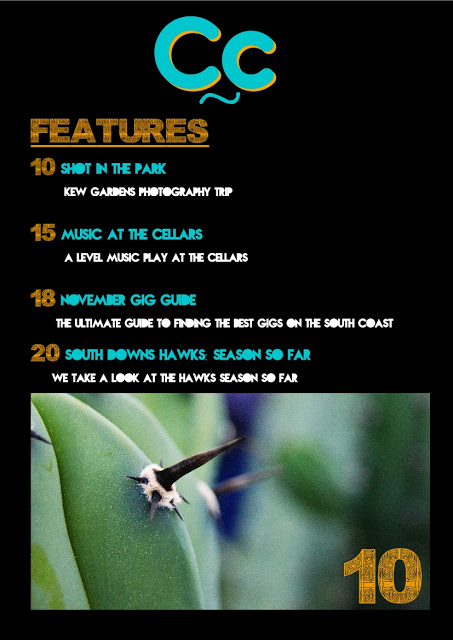
The two images above show the front cover and the contents page for my College Magazine for my preliminary task. I feel that the front cover is almost complete, with several things that need changing, like the font for the date and issue number, I think they should probably be the same front as the the rest of the coverlines, Nova, rather than the same font as the masthead, Brain Flower, also I think the colour should be orange to contrast the masthead, this will mean they stand out.
Another thing, again which is a small thing I think I should tweak with the front cover of the magazine is the masthead, I think the shadow should be orange to make it stand out more, the orange will contrast the turquoise and make the magazine stand out over other things that are available round college.
With my contents page I'm planning to redo the whole page, I feel that there isn't enough text and not enough images on the page, this is due to the layout, so for my flatplan I will show how I want the contents page to look. I'm thinking of putting an image relating to something on the contents page at the top, then having the contents title to be the same font and same colour scheme as the masthead on the front cover. Then I will seperate features and regulars into different sections, with an image taking up a 1/3, and then 2/3 writing, this will take up about a quarter of the page each. The colour scheme of the writing will be the same as it is here.
Overall I think that both will turn out to be fairly successful with changes that I plan to make, and I also think after these changes the magazine will look professional and meet my standards that I expect from myself.
Subscribe to:
Post Comments (Atom)


No comments:
Post a Comment