Thursday 20 December 2012

Preliminary Task: Final Cover, Contents and Evaluation


Both of the images above are the final versions of my front cover and contents page if you hadn't already guessed! After all of the planning and drafting I finished my magazine cover and contents page for the preliminary task. On the whole I'm quite pleased with it, there are several things that if I did it again I would change, for example I spent a lot of time trying to work out what to use to link the image with the text in the contents page, and I also forgot to include the page number in the top image, the best I could come up with was arrows for the link, but I don't think that this worked that well. 

As far as the front cover goes I think I met my standards and was unusually creative with the cover-lines and choice of font. I don't think there would be much I would change with the front cover, maybe the shape of which the cover-lines formed. Overall I think that this preliminary task was a success and has let me have a snapshot as to what to do for my Music Magazine, the final task, and then what to avoid.

Preliminary Task: Draft of Magazine


The two images above show the front cover and the contents page for my College Magazine for my preliminary task. I feel that the front cover is almost complete, with several things that need changing, like the font for the date and issue number, I think they should probably be the same front as the the rest of the coverlines, Nova, rather than the same font as the masthead, Brain Flower, also I think the colour should be orange to contrast the masthead, this will mean they stand out.

Another thing, again which is a small thing I think I should tweak with the front cover of the magazine is the masthead, I think the shadow should be orange to make it stand out more, the orange will contrast the turquoise and make the magazine stand out over other things that are available round college.

With my contents page I'm planning to redo the whole page, I feel that there isn't enough text and not enough images on the page, this is due to the layout, so for my flatplan I will show how I want the contents page to look. I'm thinking of putting an image relating to something on the contents page at the top, then having the contents title to be the same font and same colour scheme as the masthead on the front cover. Then I will seperate features and regulars into different sections, with an image taking up a 1/3, and then 2/3 writing, this will take up about a quarter of the page each. The colour scheme of the writing will be the same as it is here.

Overall I think that both will turn out to be fairly successful with changes that I plan to make, and I also think after these changes the magazine will look professional and meet my standards that I expect from myself.

Tuesday 18 December 2012

Proposal Of My College Magazine

I have a few initial ideas for my college magazine, overall the general idea for my magazine will be to make an individual, unique magazine that will stand out and appeal to the my target audience, teenagers who attend south downs college.


  • COLOUR SCHEME: As far as colours go I think that I will use turquoise, orange and white, fairly similar to 'College Magazine' featured in the last article. I hope that the orange, being in november will symbolise autumn, which is the season we are in!
  • FONTS: For the Masthead and Contents Title I am thinking of using 'BrainFlower' a font that is occasionally used in day to day life, but isn't overused, I think that it will give a fairly modern feel to the magazine, and be the kind of font that teenagers are familiar with, for the coverlines, date etc. I will use 'Nova Bold' which I have never seen used before, which makes me more inclined to use it, as I think both fonts together may not seem like they go at first but I think that they may compliment them if I use them in the right context with the correct font size. Another font I want to use, but more in the contents page than anything else will be 'Asmat 2007', I will use it for the title of the sections - regulars and features and the page numbers, I think that this will compliment the Nova font I will use in the main bulk of writing, giving the contents page a more professional effect.
  • COVER IMAGE: I will use a portrait I have taken of one of my friends Jack, a photography AS student, as he is a model student of this college (haha). Also it related back to the main coverline I have in mind as it will be about the AS photography trip to Kew Gardens.
  • IMAGES IN THE CONTENTS PAGE: As the magazine will feature a lot about photography of nature and it is spring I propose to use several images from the kew gardens trip and one that will look forward to next month - December, this will mean something Christmasy and something that will make the page featured stand out and make people want to turn to that page and read it, which is essentially what I want to happen with everything I do, but more so with contents with images. 
  • CONTENTS LAYOUT: I think initially it will involve more about playing around with various layouts rather than sticking to one idea, one of my ideas is to have a title and a small underline, then have a list of features and regulars below, with an image at the bottom.
Hopefully all of these factors will meet the targets of the task as well as meeting my expectations of what I am capable of. I will work to what I think is a fairly high standard for myself as I want this piece to be successful, but also something that I enjoy working, so it will incorporate a lot of my work, and also incorporate a lot of things that interest me, and what I think will look effective and create a well thought out and well presented college magazine

College Magazine: Research

before I start planning my college magazine I have to do some research, for this I will take some examples of college magazines that already exist, one from America and one from Britain, both will show how the culture and how the people who attend the college affect the magazines design and content.

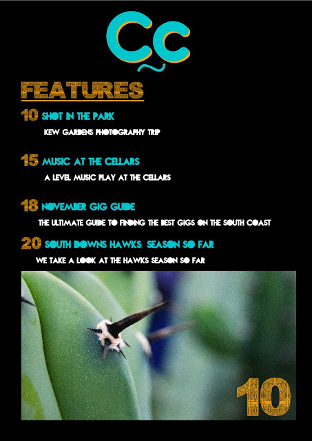
my first example of a college magazine that I will research is 'The LC' which is the magazine for Lewisham college in London. The general design of the magazine is a standard format with the title and the coverlines all being in the same place, all the same colour. In all of the editions of the magazine, in this case Autumn 2010 they feature a main coverline in bold, with a smaller regular description to go with the coverline, this may be a different font but it works with the rest of the magazine cover. Below this is the rest of the 'highlights' of the magazine, ie. the other coverlines. I think I might use something similar for my magazine as it gets the message of the magazine cover across and is quite effective.

Another thing I may use is something similar to the title because it stands out, people know what it is, and if you go to the college, which is the magazines target audience then you will know straight away what the magazine is and who it is aimed at, I hope that mine will be as clear cut.


The next magazine I will research is College magazine, which is an american paper format magazine with a fairly large web presence, created by students for students it has a professional layout and big stories for it's target audience, unlike most college magazines it is for college goers in general, not just for one specific college, with a lot of stories challenging problems that teenagers have, which makes the magazine more personal than a standard college magazine that will just inform the target audience of what is happening at their college. I think that main point is one that I will try to use in my magazine as it is a strong selling point of the magazine, and makes it more appealing to the audience, in both my magazine and this magazine is for teenagers.

The font used for the title and other things such as the colour scheme suit the photo and the clothing used in the portrait of Mike Posner in this case, this will be a useful thing to use in my magazine and will increase the appeal of the front cover, as far as contents go it will be a similar as far as the layout but will have more writing than photos.

Overall I think that both magazines are very appealing and have features that I can use for my magazine, of which all will increase the appeal of my magazine and make it stand out on the shelf from other items on the shelf. I hope that what I will put into my magazine, which will be explained on the next article, will make it appeal to the target audience and be a unique college magazine cover and contents as well as meeting the set criteria of this task.

Wednesday 7 November 2012

Monday 5 November 2012

To What Extent Should Magazines Be Held Responsible For The Social Ramifications Of The Representations They Offer?

"Our magazines are made for entertainment purposes, and shouldn't be taken as a guide to teenage girls living their lives" a quote from a spokesperson from a well known magazine, aimed at women. With these magazines there is always a catch line, for example 'Cosmo Girl' '50 WAYS TO GET SEXY HAIR', these kinds of statements give the target audience of this magazine a reason to buy it, instantly it interests a 'typical teenage girl' how to get 'Sexy Hair' or whatever the catch line may be, if it can draw the attention of the target audience then it is doing it's job, but how does this affect the people that read the magazines? are these magazines entertaining or bordering on becoming a guide for girls lives?
The way that these catch lines are written, even though they are someones opinion still suggests that they're the law, for example 'Sugar' with '63 thing you NEED to know about YOUR boobs' it is a command, you must know the information being offered, and the fact that it is made personal by talking about a physical asset women have and aren't very confident about. Another catchline example is again, from 'Cosmo Girl' - 'What he tells his friends after you hook up' this is suggesting two things, one is that you trust this magazine more than you are meant to trust your partner, and also it suggests that all of these celebrities and everyone else is 'hooking up' which twists the thoughts of the target audience to think that if they're not doing it it isn't right.

The main feature of all of these magazines is the celebrity on the front cover, who are all airbrushed, and lit up from the background to get the target audiences attention. The average age of the target audience for these magazines will be 11-16, and at the youngest age a girl is maybe at her most vulnerable and most influential, which is where in my opinion it is wrong for these magazines to advertise sex, and what is essentially being an adult to children.
All of these magazines are like peer pressure publications, because unlike another human being, you can judge their personality, and a trust is built, but with a book or a magazine there is a false sense of security, because it is seen as an authoritative figure, because it is all set out perfectly, for example in Sugar it says 'Your Summer Style...' as if to suggest if you don't dress like the way Sugar says, you won't look good this summer, which almost forces teenagers to g out and buy the latest clothes, makeup etc.
In conclusion I think that magazines of this nature should be held responsible for what they do, because even though they may defend their message it's clear a lot of young girls and teenage girls are affected by these magazines and other forms of media, but on the other hand it is also fair to say as a magazine publication it isn't the law, just like every other magazine, it is someones opinion on a fact, for example all of the style tips will be on what celebrities are wearing most, and someones opinion from the magazine.

Tuesday 9 October 2012

Who Is The Target Audience For This Magazine Cover?

Who Is The Target Audience For This Magazine Cover? How Has The Cover Attempted To Appeal To Them? And What Conventions Of Cover Design Are Evident?


In this 'Ride Uk BMX' magazine front cover from September 2012 it is fairly clear that the magazine is aimed at young people who participate in the sport of BMX, this is shown by the complete disregard for anything but riding bikes as shown in the photo, of the young man jumping over the burining ramps and grind rails, and also the title in it's special font 'DISOBEY' to outline the rebelious attitude towards riding a BMX bike. Also small things like the outline of the photo has been singed to emphasise the rebelious attitude of the cover. everything around the photo is white like it is under the spotlight, like the photo is being used as evidence in the scrapbook of a long summer of riding 20" bikes, with the plain black and white Masthead and header of the magazine cover. And the footer of the cover featuring parts of what is in the magazine and as mentioned earlier the word 'Disobey' in a unique font to emphasise the message of the photograph featured.

This cover has attempted to reach it's target audience by enticing them in with the photo of a jam in Leeds, 'King For A Day Jam', the rememberance of a young BMXer who got stabbed, where every year his friends and fellow riders come together and celebrate his life, whether it be through the bonfire or the giving out of prizes, this photo sums up what BMX is about as far as the community, riding and the yearly spectacles BMX has to offer. This gives people the chance to relate to the cover of the magazine, which entices people ever more so to buy the magazine. It also features the smaller articles along the bottom, for example 'NASS' which is the biggest action sports festival in the UK, where some of the best riders in the world come to put on a show, this will be another thing that entices people that did or didn't go to read up on what happened and what there is to come next year, altogether the cover shows off and attempts to appeal to the people of BMX very well, providing images and text that they can relate to and using a recognizable heading which has been used for years.

In this edition of Ride UK BMX magazine they have used all of the main features that any other magazine would use such as a main image, a main coverline, and the contrast of colours to create a magazine cover that stands out to the target audience, where they can clearly see what is going on and what the magazine is about with a glance. Although this magazine cover doesn't feature the left hand third technique that other magazines use, the cover is still effective and leaves a lasting image on the target audience who may just glide by the magazine in a shop or online through the rideukbmx.mpora.com

Glossary Of Magazine Terminology

Below are all of the terms used in deconstructing and analysing Magazines:


  • Texts - All forms of media are a text, including TV, radio, magazine article, film etc.
  • Niche market - In terms of magazines where a magazine will be aimed towards a specific type of person, eg. a birdwatching magazine would be for a small minority of people
  • Target Audience - the people that a magazine is aimed at
  • Codes and Conventions - Guidelines that set out what a magazine cover should have in order to see what is expected from the magazine, the following are examples of Codes and conventions
        • price
        • bar-code
        • issue number/date
        • the main photograph directly relates to the main article
        • a recognisable masthead (Title of Magazine)
        • Recognisable fonts
        • various plugs (small colourful tags) to draw in the target audience with offers etc.
        • Links between colours of month, images and text
  • Semeiotics - the reading and understanding of signs
        • Signifier - the object, denotation
        • Signified - the meaning behind the object, conotation
  • Cultural psyche - your background, it is what determines your thoughts and your identity, the following are an example of things that determine your cultural psyche 
        • Personality
        • looks
        • gender
        • age
        • family
        • upbringing
        • what you wear
        • social status
        • sexuality
        • where you're from
        • religion
        • education
        • ethnicity
  • Plugs/Puffs - a feature/offer to entice the audience
  • Main Image/Celebrity
  • Pull quote from the main article as a coverline
  • The left third - the left hand side of the cover, where when stacked you can see the main pieces of the article
  • Main Coverline - main point of the magazine, usually a double page spread within the magazine

Tuesday 2 October 2012

Why Use Blogger?

Things You Can Do With Blogger:

Blogger could be a great platform for blogging, whether it be photos or posts about random things it has  something that social networking doesn't, which is that you can go into more detail with things and it is a better platform for launching whatever you feel like, the list below give the things you can do with blogger:


- An alternative mix to posting photos, as you can post a photo with a lot of text, like telling a story

- The possibilities are endless, posting quotes, talking about day to day life, or posting about what you find interesting
- adding social media into your blog to make it more accessible for people and make it something people will go to time and time again
- It can be used as an interesting sales tool for companies, from a small clothing company to a large business trying to reach every potential customer

How Do I Think Blogger Will Be Useful For My Coursework?


Blogger will be a way that I can keep track of my coursework and push me to create new things and innovative ways of presenting my work, it will be easy to access from home, college or my phone to edit things, post random things and upload pieces of coursework, it also allows me to start a piece of coursework, and save it so I can then come back to it without having to start over again, overall I think it's a big improvement on having to print everything out